Blog
Rebecca Barnard
2016-08-08 11:32
Getting Creative with your Data
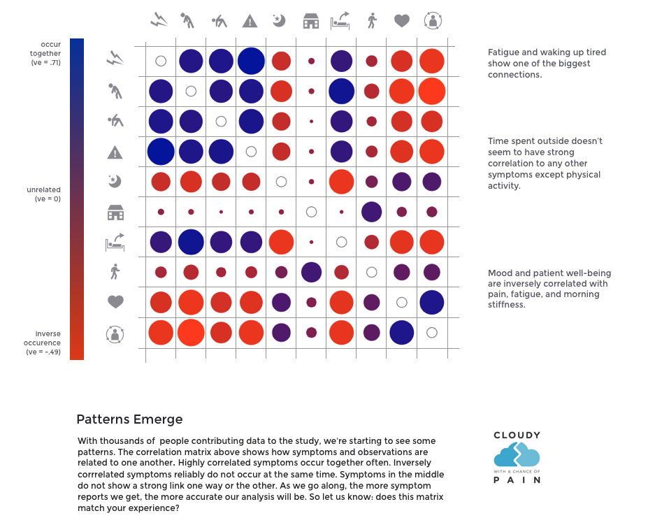
Week 1: The first newsletter after the study launched on 20th January included a visualisation showing how pain levels connected to the other nine variables in the first 850 people for whom we had a full seven days of data. In week 1, we had already collected over 130,000 records.

Week 2: Can you see a connection? The early patterns begin to emerge between the pain experienced by these participants and the 9 other measured variables.
Week 3: Sing a Song of Symptoms: We might not reach the top 40 hit with this one but this is the sound of 2 weeks worth of data. Click on the image below to have a listen.

Week 4: Whose the chilliest? The wettest, warmest, chilliest and toastiest areas we had data from that week in February.

Week 5: Holes in our data, whose the best at filling in the motif and who needs a bit of encouragement?

